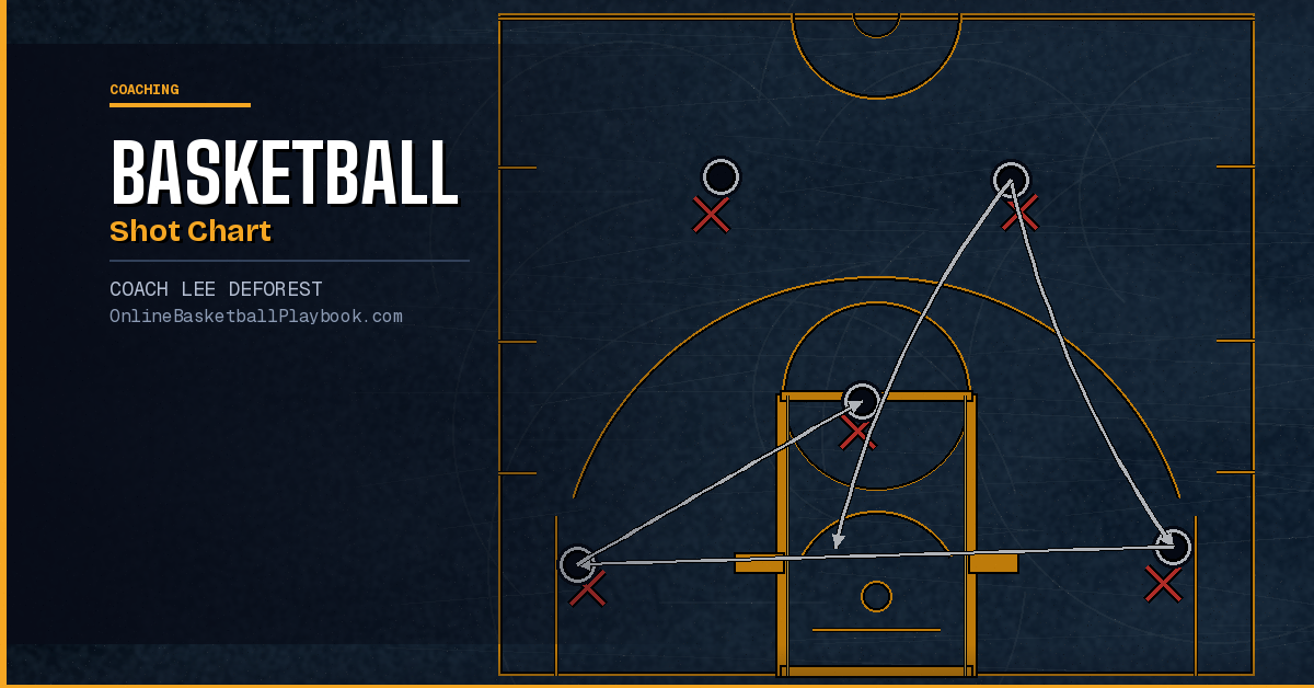

Basketball Shot Chart Guide
A shot chart maps every field goal attempt by location, result, and context. Used well, it tells you which shots your team should be taking — and which ones are quietly costing you games.
What a Shot Chart Actually Shows
A shot chart is a spatial record of your team's offense. Each dot on the half-court outline represents one field goal attempt — typically color-coded (green for a make, red for a miss) and positioned at the exact spot on the floor where the shot was released. That simple picture, when you accumulate enough attempts, starts telling a story that the box score never will.
The box score tells you a team shot 38% from three. The shot chart tells you that 60% of those attempts came from the corners — where the average efficiency is highest — and the other 40% came from the wings off off-balance, off-the-dribble pulls that shouldn't have been attempted in the first place. Those are two completely different offensive situations, and the aggregate percentage hides the difference.
Shot charts became a mainstream coaching tool at the NBA level in the early 2000s, driven by the same analytics movement that reshaped roster construction. But the underlying concept is straightforward enough that any coach at any level can use a hand-drawn version on a clipboard during a film session. You do not need software to start benefiting from shot-location tracking. You need a half-court template, a pen, and the discipline to chart every game.
What you are looking for at the most basic level: which zones produce efficient attempts for your team, which zones are volume sinks, and whether the shots your players are taking in games match the shots they practice most. When those three things are out of alignment, you have a coaching problem worth solving.
The Five Zones Every Coach Must Track
You can slice a basketball court into as many zones as you want, but for most teams — especially at the high school and college level — five zones give you actionable signal without creating so many categories that the data becomes noise.
Zone 1: The Restricted Area (Paint, 0–4 feet)
This is the highest-percentage shooting zone on the floor. At the NBA level the average sits around 63–65% from this zone; at lower levels the numbers drop, but it remains the most efficient area relative to everything else. Shots here come off drives, cuts, offensive rebounds, and post feeds. A team that generates a high volume of restricted-area attempts is doing something right offensively — they are getting to the rim, which creates pressure on the defense and draws fouls. When charting this zone, separate layups from floaters and short post shots. The efficiency drop from a rim finish to a floater is significant and worth knowing.
Zone 2: The Mid-Range (Paint, 4–16 feet)
The most contested topic in modern basketball analytics. Long twos — shots between roughly 16 feet and the three-point line — are well-documented as the lowest-value shot in the sport: they count for two points and convert at a rate closer to a three than a layup, without the extra point. Rick Pitino measured this precisely: Louisville shot 22% on challenged mid-range attempts (versus an NBA baseline of roughly 42% on contested shots), which led him to install a practice rule: if a shot would be contested, pass the ball back and restart the action. No exceptions. For most teams, the data supports limiting long twos while keeping pull-ups from the elbow and free-throw line area, which remain valuable for a different reason — they keep defenses honest and create driving lanes.
Zone 3: The Corners (Three-Point, Below the Break)
Corner threes are the most efficient three-point shot in basketball due to the shorter distance — the corner three-point line is roughly 22 feet from the basket in most modern configurations, compared to 23 feet 9 inches at the top of the arc in the NBA. Teams that chart their corner three attempts versus above-the-break attempts almost always find they underutilize the corner. Offensively, getting shooters into corner catch-and-shoot positions off drives and dribble hand-offs is a high-leverage adjustment that does not require personnel changes — it requires spacing awareness and practice repetitions.
Zone 4: Above the Break (Three-Point, Wings and Top)
High volume but lower efficiency than the corner. Above-the-break threes are worth pursuing when they come off movement — off screens, off drives-and-kicks, off transition. Spot-up threes from the wing off a reset are league-average at best. The key variable here is shot quality: a wide-open above-the-break three off a DHO is a completely different shot than a pull-up three off two dribbles with a hand in your face. Your shot chart should note contested versus open attempts within this zone, or the zone-level percentage will mislead you.
Zone 5: The Transition Zone (Any Location, Offense Running)
Not a floor location but a tempo context — and one that shot charts often miss because coaches do not annotate it. Transition attempts convert at a rate meaningfully above half-court attempts at every level of the sport. Teams that chart transition separately from half-court sets almost always discover that their fastest-break opportunities are their best scoring opportunities, which should directly inform how much practice time they devote to pushing pace and finishing in transition versus running set offense.
Make every rep competitive — against the clock, an opponent, or yourself. A shooting workout should have a winner; the most dangerous person is the one who is continually improving.
— Shooting Development, Basketball Vault
How to Read Shot Quality vs. Shot Volume
The most common mistake coaches make when looking at a shot chart for the first time is focusing entirely on makes and misses. Percentage by zone matters — but shot quality is the variable underneath the percentage, and it is worth separating before you draw any conclusions about a player or a team's shot selection.
Shot quality has two components: the location (covered above) and the contest level. A 35% three-point shooter hitting 35% on wide-open corner threes is performing right at expectation. That same shooter hitting 35% on heavily contested above-the-break pull-ups is actually a problem — they are taking bad shots and making enough of them to disguise the issue. The chart will show a cluster of red and green dots in a tough zone at a percentage that looks acceptable, when the real diagnosis is that those shots should not be taken at all.
When reading for quality, look for three patterns:
Volume without efficiency: A zone with many attempts and a below-average make rate. This is where shot selection coaching needs to happen. The mid-range two, especially from 18–22 feet, is the most common culprit.
Efficiency without volume: A zone with a high make rate but very few attempts. This often signals an under-used strength — a shooter who is excellent from the left corner but rarely gets the ball there, or a post player who converts at a high rate from the right block but only gets posted up a few times per game. These are offensive design problems with clear solutions.
Defensive hot zones: When you are scouting an opponent's shot chart, these are the zones where their best scorers convert above league or conference average. Your defensive scheme should acknowledge these zones — not necessarily to take them away completely, but to make shots from them harder. Pitino's principle applies on defense too: make contested shots more costly by systematically contesting the opponent's highest-efficiency zones.
Using Shot Charts to Drive Practice
The shot chart earns its value in practice, not film. The diagnostic tells you what shots are being taken and at what rate. The practice design question is: are we training the shots that the data says should come, from the spots those shots actually come from, and at the speed they happen in games?
The principle "train game shots, game spots, game speed" is one of the foundational shooting-development principles across coaching levels — attributed widely to Kevin Eastman, reinforced by coaches from Jay Wright at Villanova to Shaka Smart at Texas. The shot chart gives you the game shots and game spots. Your practice structure needs to supply the game speed and the competitive reps.
Here is what a data-driven practice adjustment looks like in practice. Your shot chart shows that 40% of your half-court attempts are coming from the long two zone — 18–22 feet, contested. Your team's efficiency from that zone is 29%. The fix is not to tell players to stop shooting those shots (that rarely works). The fix is to design practice situations that route the ball elsewhere. Run your breakdown drills to finish at the rim or kick to a three-point shooter. Make the long two the option of last resort by practicing the options that come before it.
On the positive side: if your shot chart shows your team is efficient from the corners but generating few corner attempts, design practice reps specifically around corner catch-and-shoot actions. Run your drive-and-kick drills with the corner as the primary kick target. Run your pin-down screen drills to pop the shooter into the corner, not the wing. Within a week of focused practice reps, the in-game volume from that zone will start to shift — because players are now training the footwork, the catch, and the release from that exact location.
Jay Wright's competitive shooting standard at Villanova — each player making 6 of 10 shots in 30 seconds coming off a screen action — is precisely this principle applied. The drill simulates a game situation (the screen), measures game-relevant output (makes under time pressure), and creates a score that players can chase. John Beilein's Michigan standard was even higher: 7 of 10 makes in 30 seconds off a down screen and flare screen sequence. These are not arbitrary numbers — they are the make rates coaches need to see in games coming off these actions, translated into a training standard that players can feel and improve against.
Building a Shooting Culture Around the Data
Shot charts work best when they are not a coaching secret. Sharing the data with your players — in film sessions, on a whiteboard, on a posted chart in your locker room — transforms shooting data from a coaching tool into a team culture. Players who understand where their best shots come from, and who can see their own shot tendencies charted visually, tend to make better decisions in games. The data becomes their internal reference point, not just yours.
The record board concept — borrowed from coaches like Shaka Smart, who posted named drill records for his Texas teams to chase — applies this idea at the practice level. When players set a new record from a specific spot or in a specific drill, they sign it. That score lives on the board until someone beats it. The effect is that shooting practice becomes competitive and self-reinforcing without the coach having to manufacture motivation every session.
Smart's Texas drill bank included a "3-Minute" drill with an explicit posted record of 157 makes — a number his teams knew and chased. The "Evans" record of 219 made shots was named after a player who set the mark. This is exactly the kind of scored, recorded, competitive environment that makes shot-making improvement stick. It links directly back to the shot chart: if your chart shows a team weakness from the left wing, you run a left-wing competition drill and post the record. The record board tracks the improvement. The shot chart, over time, shows whether the practice is translating to games.
The culture point extends to individual player development. A player who knows from their personal shot chart that they convert corner threes at 38% but above-the-break threes at only 27% has a clear, self-directed development target. They do not need a coach to tell them what to work on — the data tells them. Your job as a coach is to make sure they have the practice reps to improve the 27%, or to design your offense so they are getting more attempts from the 38% zone. Both are valid answers.
Before charting opponent zones for defensive scouting, make sure your own team's chart is two to three games deep — you need enough attempts per zone for the percentages to be meaningful. A single game of shot data can mislead more than it helps, particularly in small-sample zones like the corner or the post.
Common Shot Chart Mistakes Coaches Make
Shot chart work is straightforward in concept but easy to misapply. These are the patterns worth watching for when you start using location data to guide coaching decisions.
Treating a single-game chart as gospel. One game of shot data is a snapshot, not a trend. A team that shoots 5-for-8 from the left corner in a single game has not proven they are a left-corner shooting team — they had a good night from that spot. You need a minimum of three to five games of charted data before zone-level percentages become meaningful. Build the chart over time and let the patterns emerge from volume, not single-game noise.
Ignoring shot origin. A dot on the chart shows where the shot was released. It does not show where the ball started, what action created the shot, or how much time was on the shot clock. Two attempts from the same spot — one off a clean catch from a well-run pin-down screen, one off a contested dribble with two seconds on the clock — look identical on the chart but represent completely different shot qualities. Annotate for shot type (catch-and-shoot, off dribble, pull-up, post) when you can, or at minimum separate contested from open attempts.
Coaching the chart instead of the player. The chart is a diagnostic, not a directive. If it tells you a player shoots poorly from above the break, the answer might be to limit their above-the-break attempts — or it might be that their above-the-break form has a correctable mechanical issue. Dr. Hal Wissel's error-cause-correction framework is useful here: before you change where a player shoots, run a diagnostic on how they shoot. A flat arc, an inconsistent release, a guide-hand thumb that fires early — these are mechanical issues that the shot chart surfaces but cannot diagnose. Chart plus mechanics analysis gives you the full picture.
Skipping the transition column. If you only chart half-court offense, you are missing a significant portion of your team's attempts and your most efficient ones. Chart every attempt, tag it as transition or half-court, and keep a separate tally. Most coaches who do this for the first time are surprised by both the volume and the efficiency of their transition attempts — and it directly influences how much transition practice they allocate.
Using the chart to shame instead of teach. If a player's shot chart becomes a tool for public criticism rather than development conversation, the chart loses its cultural value quickly. Players stop shooting the shots they should take — because they are afraid of adding to a bad-looking chart — instead of developing the decision-making and mechanics to take those shots well. The chart should surface problems that you solve in practice, not problems you display as evidence of failure.
- Chart every game for at least three games before drawing conclusions — zone percentages from a single game can mislead; volume gives you real signal about shot selection tendencies.
- Separate transition from half-court attempts — transition shots convert at a measurably higher rate and should be tracked and practiced as a distinct category of your offense.
- Note contest level alongside location — an open corner three and a contested corner three look the same on the chart but represent entirely different shot decisions worth coaching differently.
- Match your top practice drills to your top-volume shot zones — if your chart shows heavy mid-range volume, design drills that route the ball to better options before the mid-range becomes available.
- Post a record board for your highest-value drill from each key zone — named records that players sign and chase turn shot-location data into a living practice culture rather than a coaching memo no one reads.
Want more basketball coaching strategies and drills?
Keep Building
Related breakdowns
Separating Shot Takers from Shot Makers in Basketball
Separating Shot Takers from Shot Makers in Basketball
How to Do a Rondo Fake Shot Fake Step Through Move in Basketball
How to Do a Rondo Fake Shot Fake Step Through Move in Basketball